Process Post: MetroCard Swipes Project

One of my last projects for the WSJ was a story and interactive map of New York City showing the usage of different types of MetroCards at different subway stations.
I always mean to write process posts, describing how I did things. I think “show your work” is a great idea and have really enjoyed reading other people’s posts showing their work.
I never got to write one about my foursquare check-ins project and by now I’ve probably forgotten too many of the details of the process to do a proper write up. Not this time. This’ll be kind of a mind dump though.
False start with turnstile data
The idea for this project came from finding the dataset available on the MTA’s developer website. In addition to the fare type data we ultimately ended up using, they also make available raw turnstile swipes and that was the one I first looked at. This was last July.
The turnstiles data contains cumulative counts of entrances and exists and status report codes for every turnstile in the system every four hours. Then there’s another file matching those codes up to station names and subway lines. In a first pass at this data, I made simple line charts of each turnstiles hourly entrances and exits. They were pretty messy and only mildly interesting. I can’t find the charts anymore or I’d show them here. Then the project lay dormant for about a year as other news intervened.
Real start, cleaning data
Eventually, the Greater New York section came upon the fare type data posted by the MTA and was interested in running a story based upon it. The fare type data set is a single for each week and records station by station how many times each type of metrocard was swiped.
Starting out, we didn’t know what the data would show and we didn’t have an entirely clear idea of what we were looking for so I decided to just clean it up and play around with the data for a bit to see if any interesting trends popped out. This is not necessarily how I would approach a data project in the future. I think we might’ve ended up with something even more interesting and more pointed if we had had some questions we wanted to answer with the data to start with.
The first step was to import all the data to one place instead of one separate file per week. A quick Python script to put everything into MySQL, then an export to Google Refine to fix inconsistent spellings of station names and then exporting to CSV.
Then I thought I’d try a non-geographic visualization. I’d make a grid with the weeks on one axis and the subway stations along another ordered from high traffic to low traffic. At each point in the grid there’d be a pie chart or a stacked bar showing the proportion of each type of swipe at that station in that week.
Using Processing
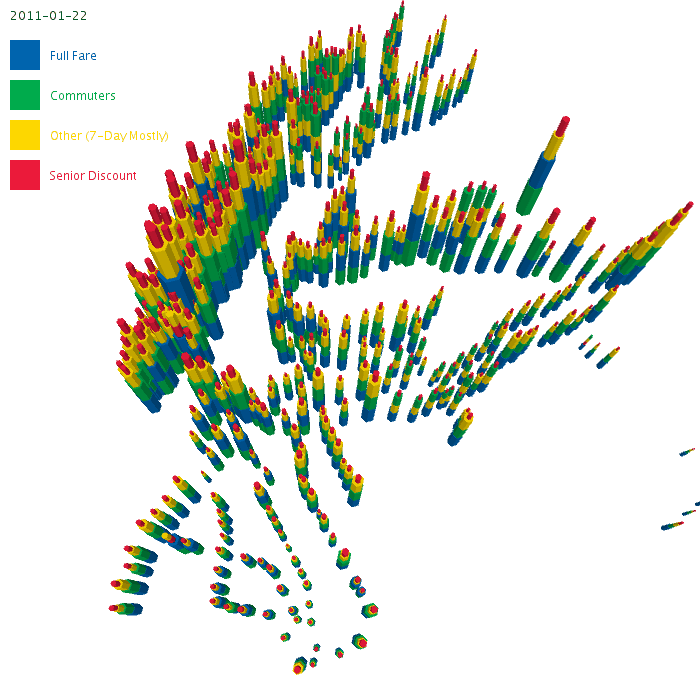
I decided to first try and do it in Processing as a way to learn more about it and 3D graphics.
It came out looking kind of like this.

So yea. I didn’t quite have the scale of the data right. 460 stations by 60ish weeks of data each? Oh that’s almost 28,000 datapoints. It was not particularly comprehensible.
Maybe it’d be better to try and place stations according to their geographic location instead of in a grid, and then animate over time.
Unfortunately, the station names in the fare type files didn’t match the station names anywhere else. They were a combination of the names shown on the official subway map, and when those conflicted, an added cross street.
The official file of station locations gave station locations by station name and line along with an exact lat lng for each entrance or exit.
I matched these up by hand, picking one entrance for each station. The resulting file is here.
After a few iterations, I ended up with something looking like this, (using the plate carrée projection, a.k.a x=lng, y=lat)
Kind of cool. Still not exactly easy to make sense of, even though in processing I can adjust the camera and fly around it.
Time to try another tack.
Using R
Since trying to visualize the data straight away wasn’t working so well, I decided to try and analyze the data in R and find some basic summary statistics.
I use R in RStudio rstudio.org which is a really nice IDE for R. I’m almost a complete beginner at R, and it’s been really helpful.
There’s this really cool function, summary(dataframe) that takes some data and prints out a whole bunch of summary statistics of it. So I did:
MTAFARES1108 <- read.csv("~/MTAFARES1108/data/MTAFARES1108_cleaned.csv")
summary(MTAFARES1108)
and got out
      start_date          end_date         REMOTE                             STATION
 2010-08-21:  466   2010-08-27:  466   R001   :   61   42ND STREET & GRAND CENTRAL:  183
 2010-11-06:  466   2010-11-12:  466   R002   :   61   23RD STREET-6TH AVENUE     :  122
 2010-11-20:  466   2010-11-26:  466   R003   :   61   25TH STREET-4TH AVENUE     :  122
 2010-11-27:  466   2010-12-03:  466   R004   :   61   34TH STREET & 6TH AVENUE   :  122
 2010-12-04:  466   2010-12-10:  466   R005   :   61   34TH STREET & 8TH AVENUE   :  122
 2010-12-11:  466   2010-12-17:  466   R006   :   61   42ND STREET & 8TH AVENUE   :  122
 (Other)   :25535   (Other)   :25535   (Other):27965   (Other)                    :27538
       FF            SEN.DIS      X7.D.AFAS.UNL  X30.D.AFAS.RMF.UNL  JOINT.RR.TKT       X7.D.UNL
 Min.   :     0   Min.   :    0   Min.   :   0   Min.   :   0.0     Min.   :   0.0   Min.   :    0
 1st Qu.:  9517   1st Qu.:  363   1st Qu.:  37   1st Qu.: 128.0     1st Qu.:   1.0   1st Qu.: 3080
 Median : 16029   Median :  664   Median :  78   Median : 262.0     Median :   5.0   Median : 6226
 Mean   : 27757   Mean   : 1217   Mean   : 113   Mean   : 412.6     Mean   : 104.4   Mean   : 8999
 3rd Qu.: 32164   3rd Qu.: 1427   3rd Qu.: 147   3rd Qu.: 490.0     3rd Qu.:  26.0   3rd Qu.:11638
 Max.   :291172   Max.   :13083   Max.   :1082   Max.   :5062.0     Max.   :7951.0   Max.   :97486

   X30.D.UNL      X14.D.RFM.UNL       X1.D.UNL         X14.D.UNL       X7D.XBUS.PASS
 Min.   :     0   Min.   :  0.00   Min.   :    0.0   Min.   :    0.0   Min.   :   0.00
 1st Qu.:  5134   1st Qu.:  0.00   1st Qu.:    0.0   1st Qu.:    0.0   1st Qu.:   7.00
 Median : 11295   Median :  2.00   Median :    8.0   Median :  108.0   Median :  20.00
 Mean   : 19833   Mean   : 12.65   Mean   :  325.9   Mean   :  665.8   Mean   :  86.85
 3rd Qu.: 26114   3rd Qu.: 16.00   3rd Qu.:  226.0   3rd Qu.:  915.5   3rd Qu.:  73.00
 Max.   :276941   Max.   :251.00   Max.   :18867.0   Max.   :21757.0   Max.   :2371.00

      TCMC         LIB.SPEC.SEN      RR.UNL.NO.TRADE   TCMC.ANNUAL.MC   MR.EZPAY.EXP
 Min.   :   0.0   Min.   :0.000000   Min.   :    0.0   Min.   :    0   Min.   :   0.0
 1st Qu.:  44.0   1st Qu.:0.000000   1st Qu.:    3.0   1st Qu.:  386   1st Qu.:  17.0
 Median : 104.0   Median :0.000000   Median :   12.0   Median :  854   Median :  49.0
 Mean   : 271.2   Mean   :0.006424   Mean   :  280.7   Mean   : 1416   Mean   : 175.3
 3rd Qu.: 283.0   3rd Qu.:0.000000   3rd Qu.:   69.0   3rd Qu.: 1701   3rd Qu.: 168.0
 Max.   :3600.0   Max.   :3.000000   Max.   :16197.0   Max.   :21629   Max.   :2890.0

  MR.EZPAY.UNL        PATH.2.T         AIRTRAIN.FF      AIRTRAIN.30.D      AIRTRAIN.10.T
 Min.   :   0.00   Min.   :    0.00   Min.   :    0.0   Min.   :    0.00   Min.   :   0.00
 1st Qu.:  12.00   1st Qu.:    0.00   1st Qu.:   22.0   1st Qu.:    0.00   1st Qu.:   0.00
 Median :  35.00   Median :    0.00   Median :   56.0   Median :    0.00   Median :   0.00
 Mean   :  92.81   Mean   :   34.48   Mean   :  274.9   Mean   :   46.38   Mean   :  13.59
 3rd Qu.: 113.00   3rd Qu.:    0.00   3rd Qu.:  161.0   3rd Qu.:    0.00   3rd Qu.:   0.00
 Max.   :1707.00   Max.   :10265.00   Max.   :47909.0   Max.   :17933.00   Max.   :6150.00

 AIRTRAIN.MTHLY        total
 Min.   :  0.000   Min.   :     1
 1st Qu.:  0.000   1st Qu.: 21130
 Median :  0.000   Median : 37422
 Mean   :  1.111   Mean   : 62134
 3rd Qu.:  0.000   3rd Qu.: 76816
 Max.   :687.000   Max.   :697709
Similarly, the plot function has a cool default when called on a dataframe that prints a whole bunch of summary plots.
BYDATE <- aggregate(MTAFARES1108[,c(5,6,10,11,13,14,27)], list(start_date=MTAFARES1108$start_date), sum)
BYDATE$subtotal <- rowSums(BYDATE[,c(2:7)])
plot(BYDATE)
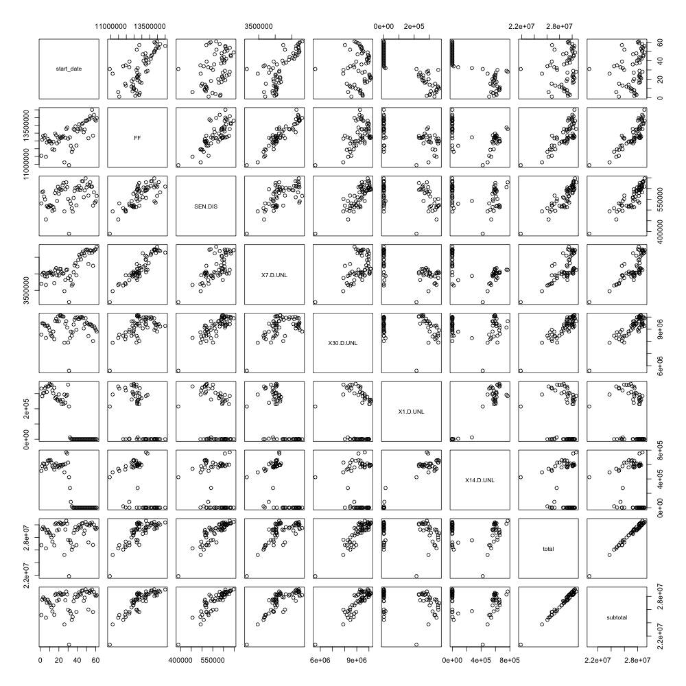
BYSTATION <- aggregate(MTAFARES1108[,c(5,6,10,11,27)], list(STATION=MTAFARES1108$STATION), sum)
BYSTATION$subtotal <- rowSums(BYSTATION[,c(2:5)])
plot(BYSTATION)

Printed out big, these are kind of fun to look at. Each variable in the data is in a scatter plot with each other variable.
You can see some trends in these plots. The usage of full fare and seven-day unlimited cards trending up when the one and 14-day unlimited cards are discontinued. The usage of different types of cards are generally pretty well correlated with others. At PATH stations, only full fare cards are used so there’s a set of stations without unlimited card swipes.
More data, mooore data

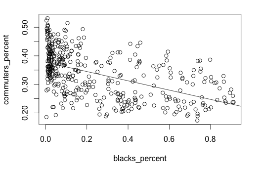
Now I already had a database full of census data on population from making Census Map Maker so I decided to bring that in too. I wrote a Python script (GeoDjango script to be exact) to loop through all the 2010 census blocks for Manhattan, Brooklyn, Queens and the Bronx and assign each block to the closest subway station and then calculate the union polygon of the set of blocks for each subway station. Then each shape was assigned the data for that subway.
Later I limited each area to also be within 1000 meters of a subway stop to get the final shapes.
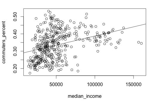
By doing this, we get the race and income data for each area around a subway. That could be interesting to look at. Exporting back into a CSV file with one row per station and then using R again gives us a couple of charts like these below. Each point represents one subway station area. The y-scale, commuters_percent is people using 30 day unlimited or TransitChek unlimited metrocards.

Call:
lm(formula = commuters_percent ~ whites_percent)

Residuals:
      Min        1Q    Median        3Q       Max
-0.236574 -0.048477 -0.004978  0.048037  0.198023

Coefficients:
               Estimate Std. Error t value Pr(>|t|)
(Intercept)     0.28391    0.00543   52.28   <2e-16 ***
whites_percent  0.15259    0.01207   12.64   <2e-16 ***
---
Signif. codes:  0 ‘***’ 0.001 ‘**’ 0.01 ‘*’ 0.05 ‘.’ 0.1 ‘ ’ 1

Residual standard error: 0.0689 on 390 degrees of freedom
Multiple R-squared: 0.2905,	Adjusted R-squared: 0.2887
F-statistic: 159.7 on 1 and 390 DF,  p-value: < 2.2e-16
Call:
lm(formula = commuters_percent ~ blacks_percent)

Residuals:
      Min        1Q    Median        3Q       Max
-0.191503 -0.052115 -0.001902  0.054073  0.155704

Coefficients:
                Estimate Std. Error t value Pr(>|t|)
(Intercept)     0.377349   0.004894   77.10   <2e-16 ***
blacks_percent -0.162457   0.013517  -12.02   <2e-16 ***
---
Signif. codes:  0 ‘***’ 0.001 ‘**’ 0.01 ‘*’ 0.05 ‘.’ 0.1 ‘ ’ 1

Residual standard error: 0.06987 on 390 degrees of freedom
Multiple R-squared: 0.2703,	Adjusted R-squared: 0.2684
F-statistic: 144.4 on 1 and 390 DF,  p-value: < 2.2e-16
Call:
lm(formula = commuters_percent ~ median_income)

Residuals:
      Min        1Q    Median        3Q       Max
-0.179520 -0.058256 -0.002264  0.053546  0.206933

Coefficients:
               Estimate Std. Error t value Pr(>|t|)
(Intercept)   2.823e-01  8.225e-03  34.326  < 2e-16 ***
median_income 1.055e-06  1.411e-07   7.476 5.11e-13 ***
---
Signif. codes:  0 ‘***’ 0.001 ‘**’ 0.01 ‘*’ 0.05 ‘.’ 0.1 ‘ ’ 1

Residual standard error: 0.0765 on 390 degrees of freedom
Multiple R-squared: 0.1253,	Adjusted R-squared: 0.1231
F-statistic: 55.89 on 1 and 390 DF,  p-value: 5.109e-13
So these are pretty noisy and I didn’t get all that far with an analysis. We ended up not doing anything with these regressions. I’m posting the datafile here in case anyone else wants to play around with it further.
Fare price increase
Next was to try and see if the fare increase made a difference in people’s metrocard usage habits. Looking at systemwide usage, there were big dips in the number of swipes in weeks without five working days as so much usage is by people commuting. To smooth things out for comparison, I cut out holiday weeks and then picked as many from before and after as there was still data for. This turned out to be 27 weeks each.
Testing to see if there was a significant change was done like this in R, one t-test at the 99% confidence level for each station and type of swipe.
t.test(after$swipes,before$swipes,conf.level=0.99,var.equal=TRUE)
Restrospective
Ultimately, once all the data work was complete building the map interactive itself was fairly straightforward. The part I think worked best was the annotations with descriptions of interesting points to look at. Despite having that though, I still think this project ended up kind of falling victim to the throwing data at readers problem. It could’ve beneftied from an even stronger narrative strand to tell a specific story.
As noted at the beginning, we didn’t have a good sense of what story we wanted to tell or what questions we wanted to answer, so in the data analysis I kind of struggled to figure out what was interesting and what wasn’t.
Someone suggested on Twitter having a feature where users could add annotations or questions to each subway stop. In retrospect, I think this would’ve been really useful and I wish I had built that in. So many of the stories are probably local and specific to a subway station. And there are probably interesting data anomalies at that level that people could ask about and then we could put in the reporting effort to find answers.